
Showcase

Blending Strategic Thinking with Creative Design

I use design to create meaningful and effective solutions across marketing, branding, and user experience.

By blending creativity with strategic thinking, I craft visually compelling and highly functional designs that enhance communication, engagement, and overall impact.

My approach ensures that every design serves a purpose, delivering both aesthetic appeal and practical value. 

Tim logo - white

THIRST

Brochure Design

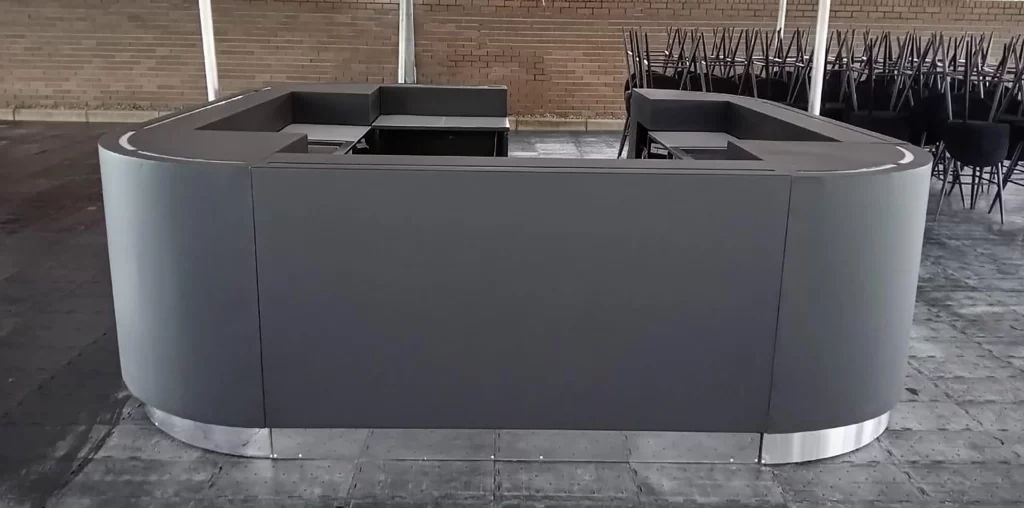
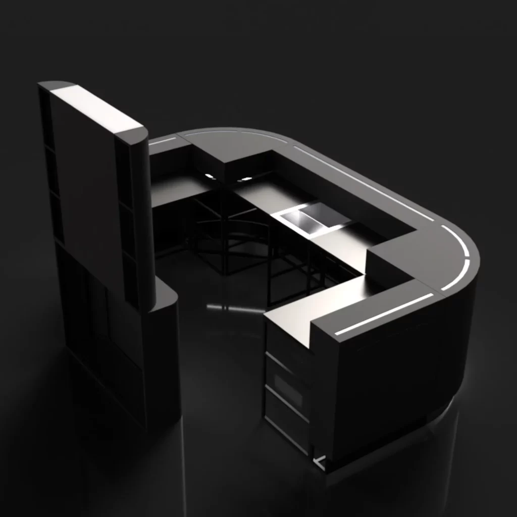
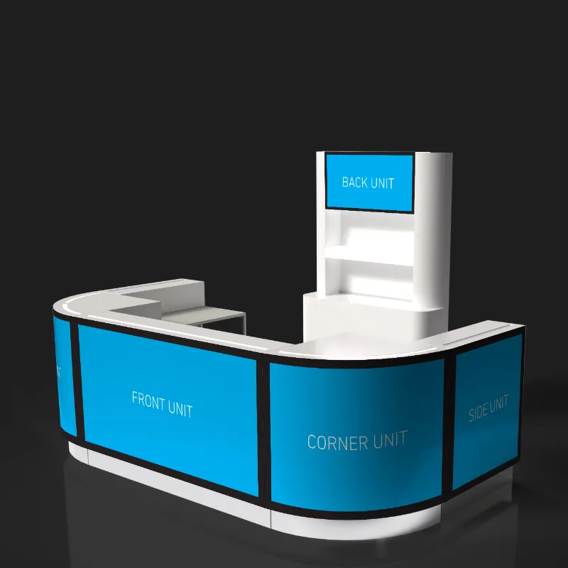
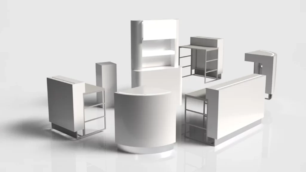
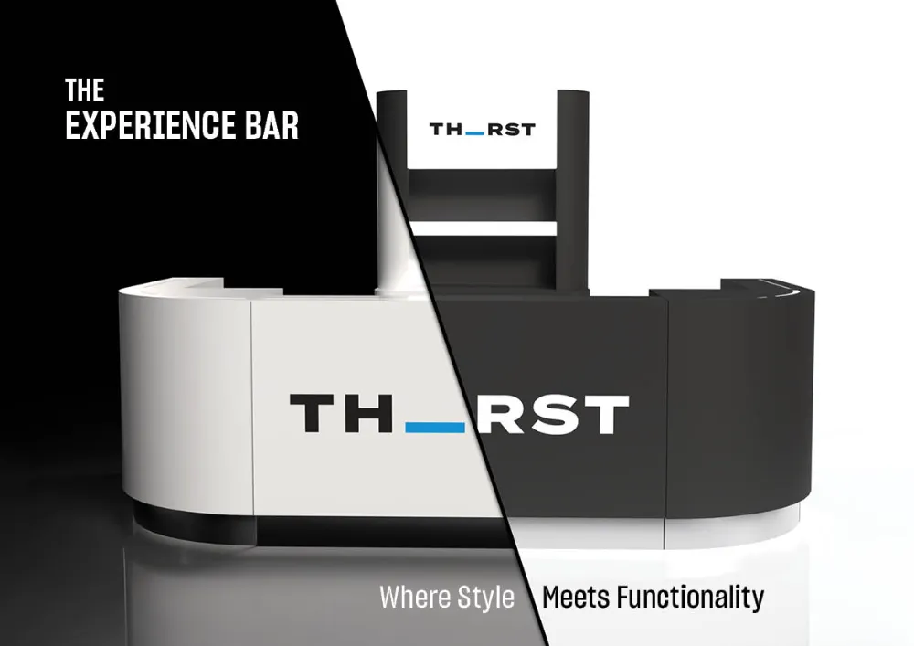
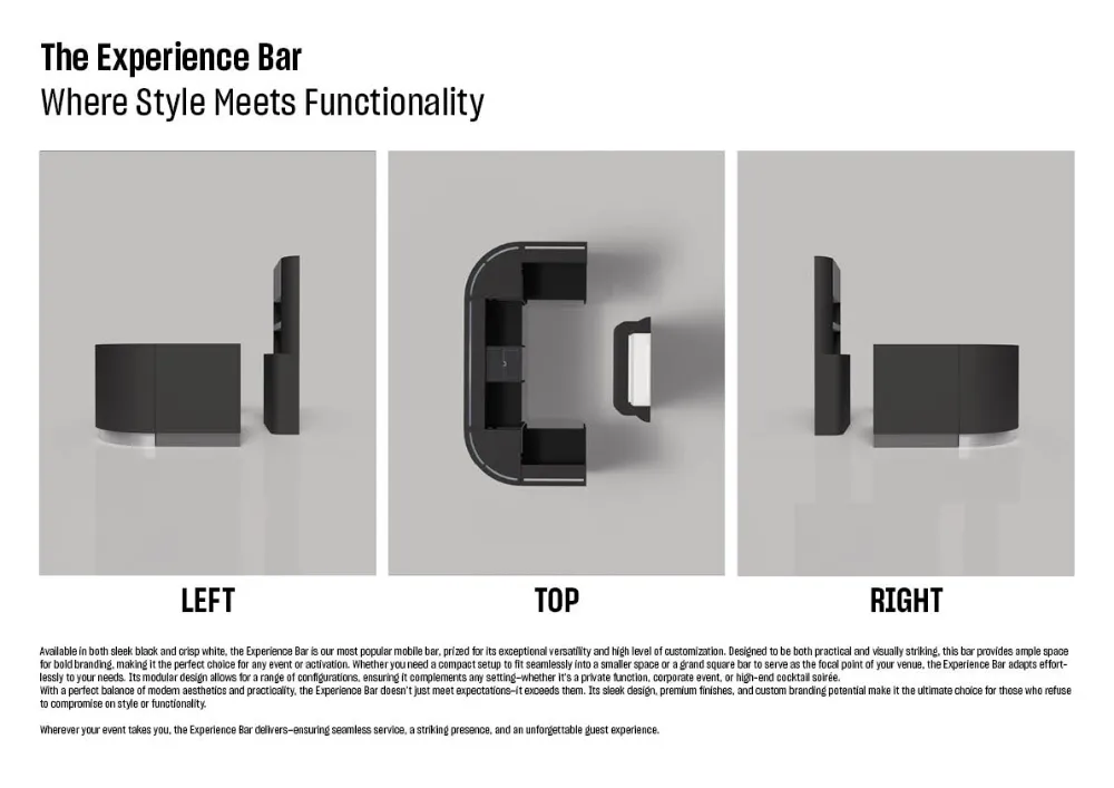
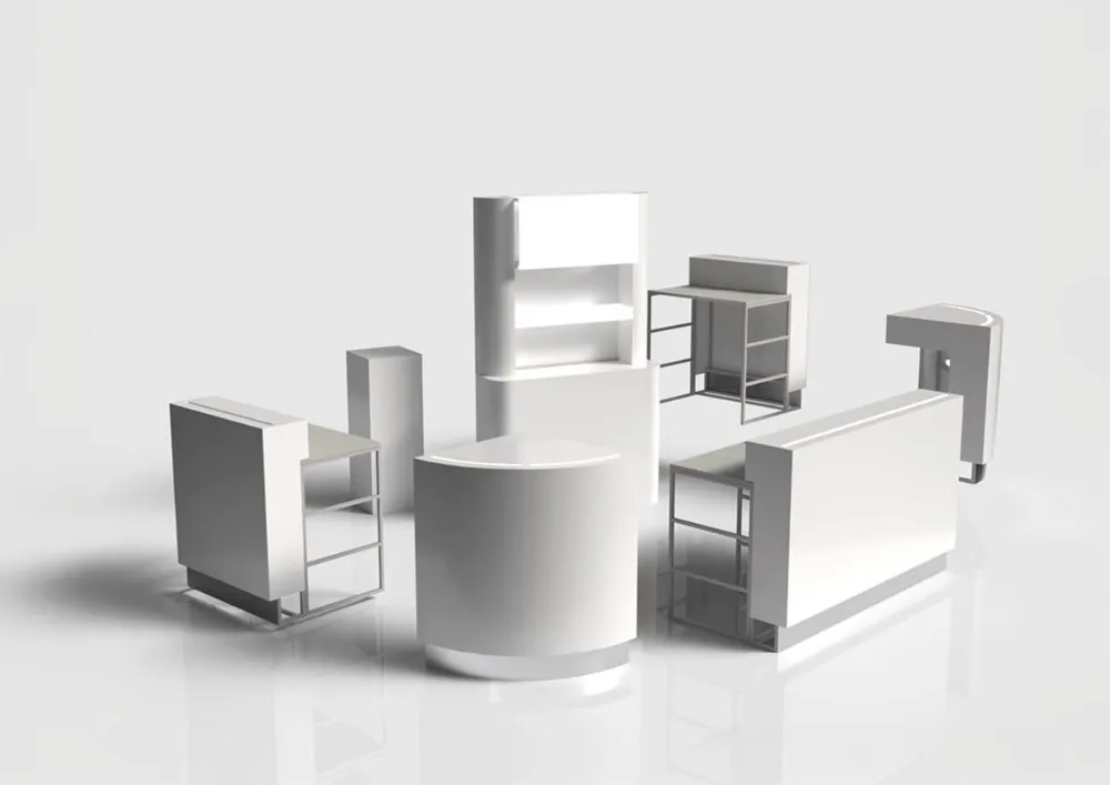
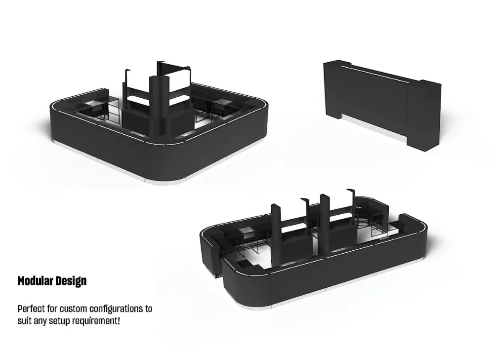
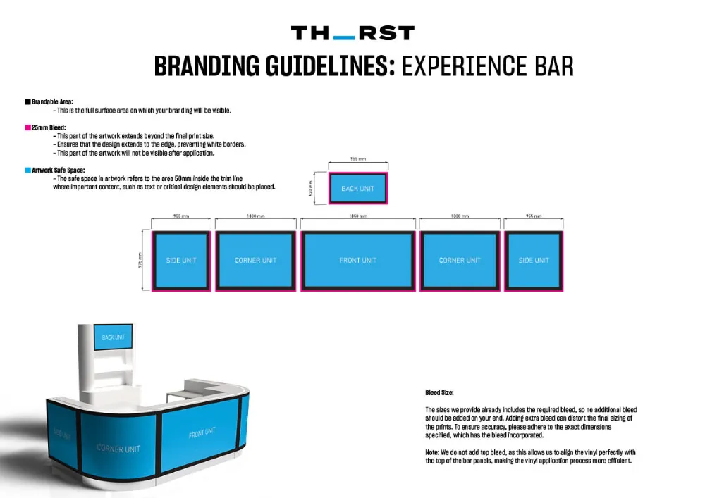
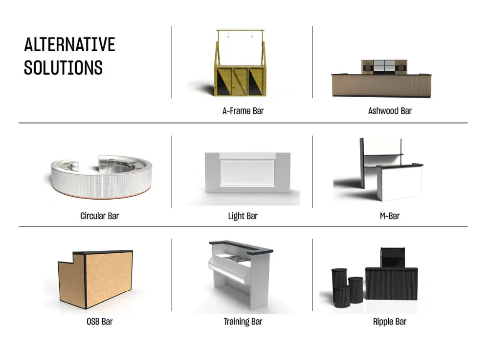
I designed a streamlined, visually compelling brochure featuring to-scale 3D renders and detailed branding guidelines to help clients quickly assess Thirst’s Experience Bar. 

The Problem

Thirst’s Experience Bar is a sought-after mobile bar solution, offering versatility for a wide range of events. However, there was no streamlined way for clients to quickly evaluate its suitability for their specific needs. Without dedicated marketing materials, the selection process required frequent back-and-forth communication with the sales team to request sizing details and multiple mockups, slowing down decision-making

The Solution

To enhance the client experience and streamline the selection process, I identified an opportunity to create dedicated marketing material. By consolidating all essential details into a single, visually compelling brochure, clients can now quickly assess the Experience Bar’s suitability for their event without the need for extensive consultations. 

Implementation

I developed a brochure that is both visually compelling and easy to navigate, ensuring all relevant details are clearly presented. To achieve this, I created to-scale 3D drawings of the Experience Bar to generate photorealistic renders, effectively showcasing the bar’s design and providing high-quality mockups for client visualization. I also developed detailed branding guidelines, including all relevant specifications, to ensure consistency and ease of customization. The structured content and strategic design placement enhance clarity, making the selection process intuitive. This solution allows clients to make informed decisions efficiently, reducing consultation time and expediting the sales process. As a result, the sales team can now focus on conversions rather than repetitive inquiries.

Adobe Illustrator
Adobe Photoshop

The end result

PAULET PRINT

Website Design

Bold Design Meets Purposeful UX – Driving Leads for a Dynamic Print Company

The Problem

Paulet Print is a bold and innovative printing company specialising in high-quality branding solutions. With a strong focus on vibrant visuals and creativity, they required an online presence that matched their dynamic personality and helped convert visitors into real business leads.

Prior to my involvement, Paulet Print had engaged another company to build their website. Unfortunately, the project was left incomplete, resulting in a half-finished site that did not accurately represent the brand’s quality or energy. The unfinished and unpolished website posed a risk to their professional image, leaving them without a credible online presence and potentially damaging their reputation with prospective clients.

Paulet Print needed a complete, ground-up solution that would not only replace the abandoned work but fully realise their brand online, provide a seamless user experience, and actively drive new business enquiries.
The Solution

To solve this, I made the decision to scrap the incomplete, underwhelming site entirely and rebuild Paulet Print’s online presence from scratch. Starting fresh allowed me to create a website that truly reflected the bold, vibrant identity of the brand while ensuring the site was designed strategically to convert visitors into leads.

I took full ownership of the project, managing the process end to end, from UX planning and visual design to development and copywriting. The new website was created with a focus on performance, clarity, and a seamless customer journey.

Key outcomes included:

A fully custom-designed and developed website, featuring a 1-page scrolling homepage with 9 dedicated subpages to showcase individual services. A clear, sales-funnel-driven user journey designed to guide visitors towards making contact.

Full integration of Paulet Print’s established corporate identity, which I had previously designed. This ensured consistency across their logo, brand colours, and graphic patterns, tying their digital presence to their broader branding.

Complete website copywriting, delivering clear, engaging, and conversion-focused messaging tailored to their services and audience. The result was a bold, high-impact website built from the ground up to showcase Paulet Print’s expertise and drive new business.

Implementation

By completely rebuilding the website from scratch—discarding the incomplete and ineffective work, I was able to deliver a fully realised, high-performing site that reflects Paulet Print’s professionalism and creativity. Through intentional design, strategic layout, and compelling messaging, the new website now guides visitors from curiosity to conversion, working as an effective lead-generation tool.

By integrating the existing corporate identity and applying it consistently throughout the site, the final product creates a seamless and memorable brand experience that feels unmistakably Paulet Print. This project stands as a strong example of balancing creative design with practical functionality, delivering a striking, interactive website that actively supports business growth while protecting and elevating the client’s professional reputation.

Homepage Strategy:

The homepage was designed using sales funnel logic to move visitors through the site and towards enquiry in a natural, engaging way.

Key features included:

Above-the-fold slider using Slider Revolution to immediately capture attention and reduce bounce rates.

Strategic use of negative margins to create overlapping sections and visual interest.

Vibrant solution boxes styled in CMYK colours (cyan, magenta, yellow), representing the print industry, with an interactive 3D flip effect to engage users. Each links to a standalone service page for more information.

Example Solution Page:

The Vehicle Branding page was designed as a focused, conversion-friendly landing page.

Features include:

Concise service overview to quickly inform users without overwhelming them.

A bold hero section with a clear call-to-action button linking directly to the contact form.

High-quality imagery showcasing completed projects to build trust and inspire confidence.

A strategically placed contact form located beneath the examples to encourage immediate enquiries.

A FAQ accordion at the bottom of the page to address common questions without crowding the main content.

Outcome

The final result is a bold, user-focused website that not only captures Paulet Print’s vibrant personality but also successfully restored their online presence following the failed previous attempt.

Wordpress
Elementor
Slider Revolution
Yoast
Fluent Forms
ChatGPT
Adobe Illustrator
Adobe Photoshop

Brand O’matic

SVO-Inspired Decal Kit

Bringing Performance Aesthetics to Life

Bringing Performance Aesthetics to Life

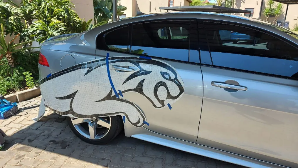
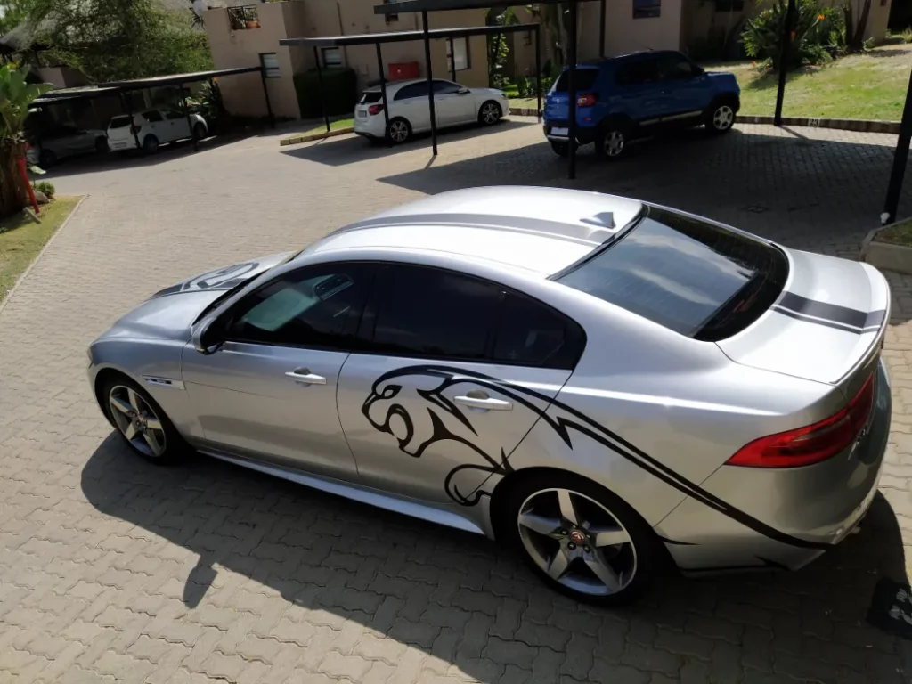
This Jaguar XE underwent a striking transformation with a custom SVO-inspired decal kit that I designed, supplied, and applied. The objective? To enhance its sporty and aggressive appeal while keeping it sleek and elegant.

The Design

Bold Racing Stripes

Flowing from the bonnet to the boot, these stripes add a motorsport-inspired look.

Jaguar Big Cat Graphic

A custom side graphic that accentuates the car’s dynamic and powerful stance.

Flawless Integration

The design follows the natural body lines, ensuring a seamless factory-quality appearance.

The Process

Custom Design

Created from scratch to align with Jaguar’s performance-driven DNA.

Premium Vinyl

High-quality, durable material with UV resistance and a smooth finish.

Precision Application

Every piece was meticulously measured, cut, and applied by hand, ensuring a professional, long-lasting result.

The Final Look

The result is a one-of-a-kind Jaguar XE that blends performance styling with a factory-level finish. This project was all about bringing personality, presence, and attitude to the vehicle without compromising its premium feel.

Adobe Illustrator
Adobe Photoshop

ELAVELLE

Brand Design

A fusion of elegance and strategy, capturing an essence with bold impact

Objective

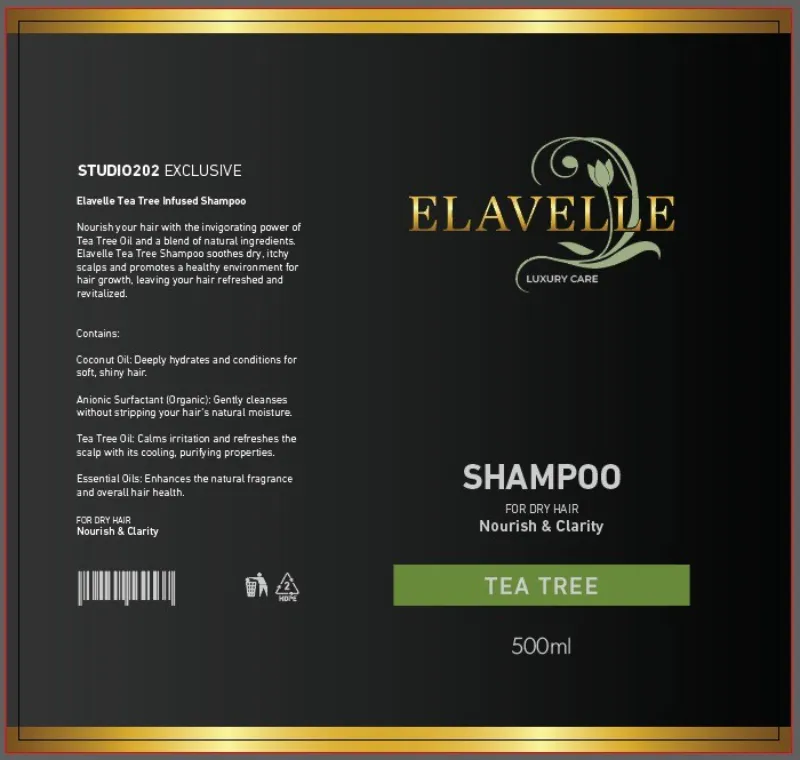
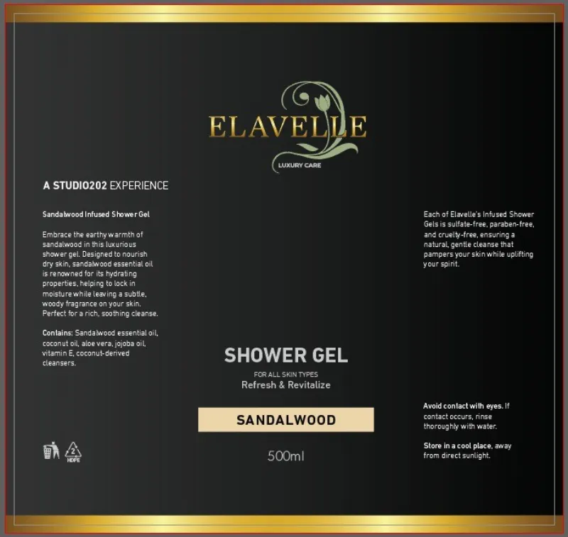
The client approached me with a high-quality personal care product but lacked a brand identity, name, and packaging. They needed a luxury brand that would reflect the premium nature of their product, infused with Tea Tree, Sandalwood, and Rosemary.

The challenge was twofold:

Brand Creation from Scratch – I needed to develop a brand name, logo, color scheme, and product labels that aligned with their vision of high-end, natural self-care.

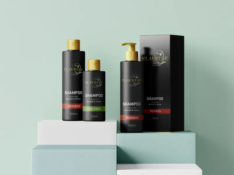
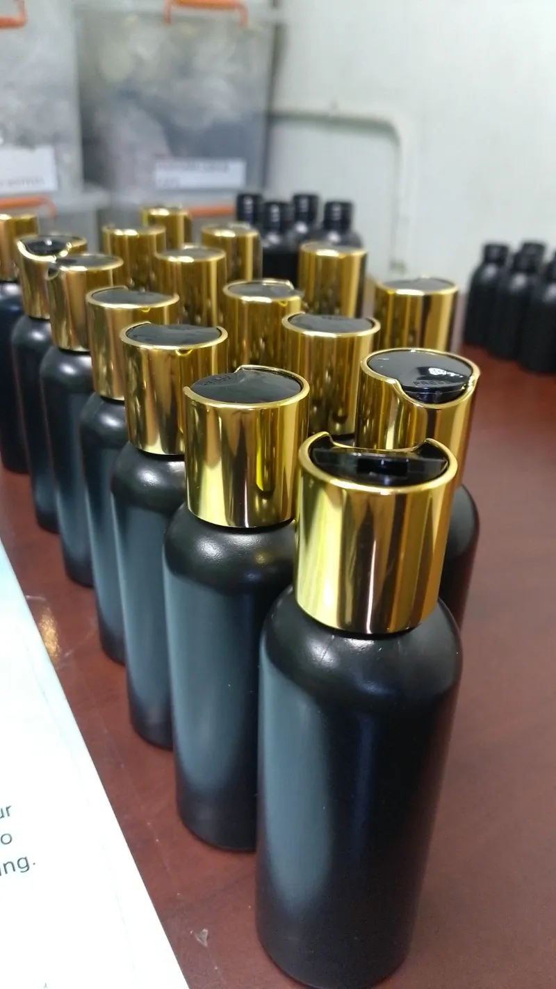
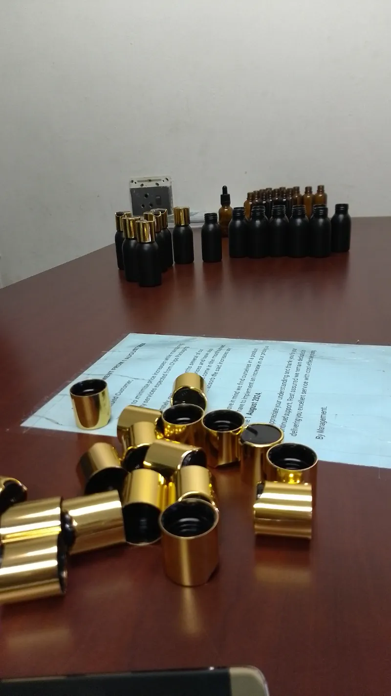
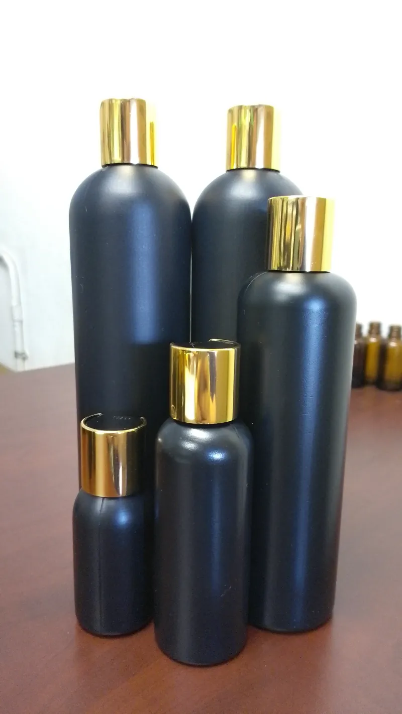
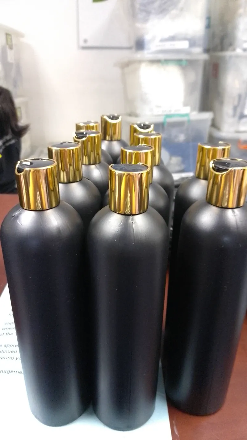
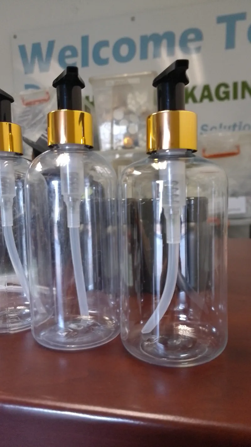
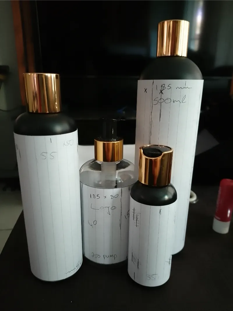
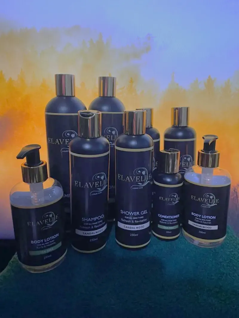
Tight Deadline & Full Production – This was a freelance project I undertook alongside my full-time job, with only three weeks to complete everything. I conducted extensive research to find the best bottle options based on quality, quantity, size, and availability before sourcing premium black bottles with gold caps in four sizes (50ml, 100ml, 250ml, 500ml). Additionally, I handled the branding, printed and applied the labels, and shipped the final products.

Approach

Recognizing the tight deadline, I collaborated with my friend Amy, who provided additional support to ensure we met the project’s demanding timeline. Her assistance helped streamline parts of the process, allowing us to work more efficiently while maintaining the highest quality in branding and production.

Naming the Brand

The first step was creating a unique, luxurious brand name that was also available as a domain. After brainstorming multiple options, I shortlisted three. Among them, I leaned towards Elavelle because:

It was a fusion of “Elevate” and the Latin word “Velle”, meaning “to wish” or “to want.” This combination reflected the brand’s commitment to enhancing self-care and luxury.

It had a sophisticated, elegant sound, fitting for a luxury self-care line.

It aligned with the brand’s high-end positioning.

I had a strong vision for a logo design based on the name.

The client instantly loved it, and we locked it in.

Logo Development

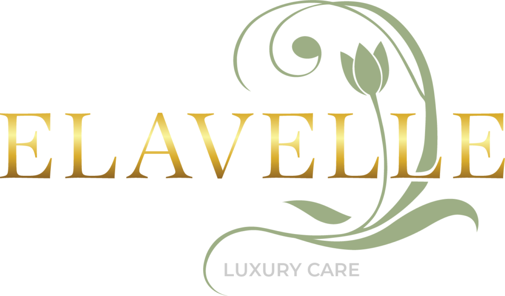
I started with a monochrome green tulip icon, symbolizing natural beauty, elegance, and purity. After presenting a rough draft, the client approved the direction, so I refined it further by:

Selecting gold gradient typography for a premium, high-end feel.

Using a black background for contrast and luxury.

Fine-tuning the tulip icon’s placement and size to balance aesthetics and readability.

The final logo captured both luxury and a connection to nature, and the client immediately fell in love with it.

Label Design & Product Presentation

Once the logo was finalized, I designed labels for each product and size, ensuring:

Color-coded differentiation between infusions (Tea Tree, Sandalwood, Rosemary, Lavender).

Clean and luxurious typography, balancing premium aesthetics with readability.

A consistent, modern layout that maintained elegance across all bottle sizes.

Execution

Collaboration played a crucial role in meeting the deadline. Working with Amy, I divided key tasks, keeping the project on track while maintaining high standards for quality and consistency. With only three weeks to complete the entire project, I managed everything from branding to sourcing to final production.

Sourcing & Production

Finding black bottles with gold caps in all four sizes was challenging, but I secured a supplier that met the luxury standard.

Due to the tight deadline, no printing company could meet the schedule, so I printed the labels myself on vinyl through Thirst, where I work. This allowed me to ensure quality and complete the project on time.

I personally applied every label to the bottles, ensuring a perfect finish.

Final Packaging & Delivery

Before shipping, I took final product photos to capture the brand’s essence.

I packaged and shipped the products via Pudo lockers, ensuring the client received them on time for their presentation.

The client successfully presented a fully branded, high-end product line that was ready for market.

Final Outcome & Takeaways

This project was more than just a branding assignment—it was a full-scale product launch. I handled everything from brand strategy to logistics, proving my ability to:

Develop a luxury brand from scratch (Name, Logo, Color Palette, Labels).

Deliver a complex project under a tight deadline while managing a full-time job.

Source materials, oversee production, and ensure the final product was flawless.

Problem-solve quickly, securing premium packaging that aligned with the brand’s identity.

Adobe Illustrator
Adobe Photoshop

MAKOLA FUNERALS

Logo Design

Elegance and Symbolism in Motion – Creating a Distinguished Identity for a Funeral Services Brand

Project Overview

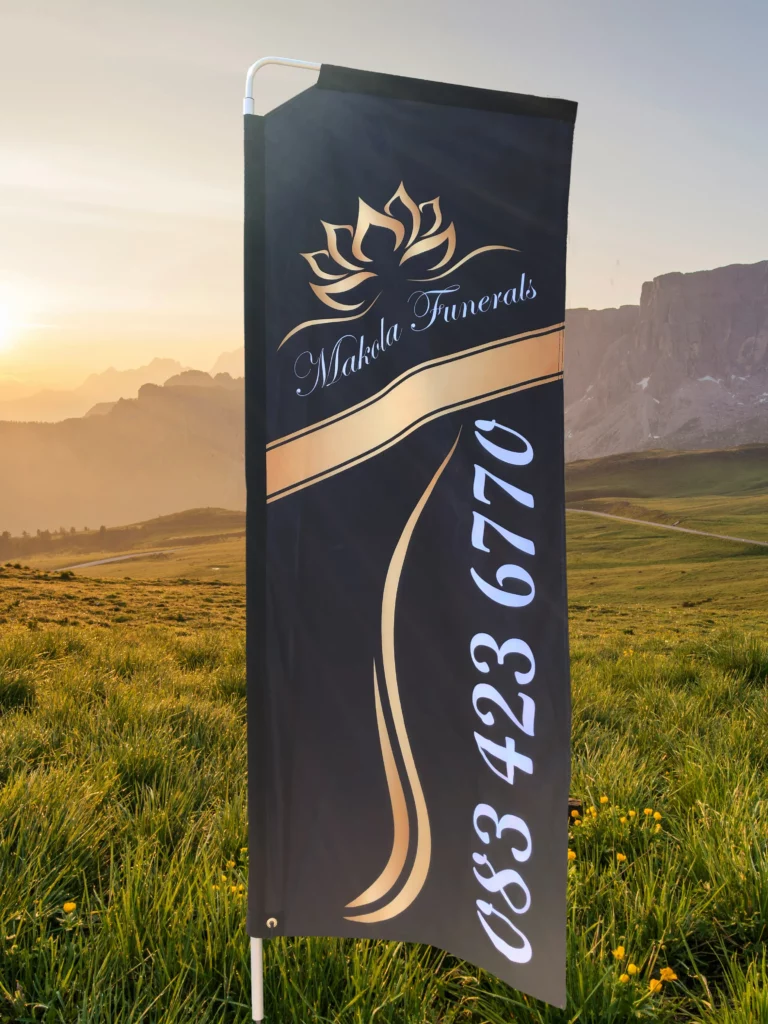
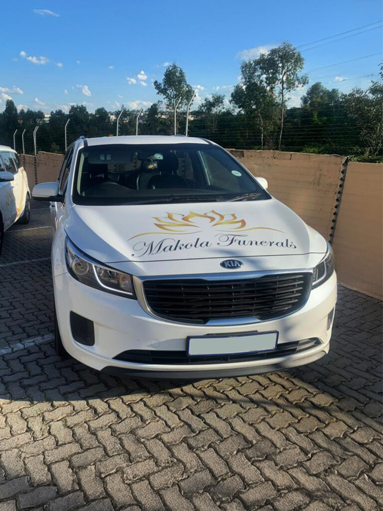
Makola Funerals approached me to develop their first-ever brand identity. They wanted an elegant and professional look that would reflect the dignity and care they bring to their services. The project required a logo design and a branding solution for their fleet of vehicles, ensuring a cohesive and recognizable presence in the industry.

Brand Concept & Execution

With no prior branding in place, I had the opportunity to create a timeless and meaningful visual identity. The design process included:

Logo Design:

The centerpiece of the brand is a stylized lotus flower, which carries deep symbolic meaning across many cultures. It represents peace, remembrance, and renewal, making it a fitting choice for a funeral services brand. The lotus is often associated with spiritual growth and the journey from one stage of existence to another, reinforcing the sense of reverence and dignity essential to this industry. The flowing, curved lines of the petals create a sense of softness and tranquility, while their upward-reaching form symbolizes hope and transcendence. The gold gradient ensures the brand exudes both compassion and professionalism.

Typography:

The client had already selected a classic script font, which I refined to ensure readability across different applications.

Fleet Branding:

To bring the brand to life beyond the logo, I designed graceful gold accent lines that flow along the vehicles, creating a sense of movement and elegance. The branding was applied to multiple fleet vehicles, ensuring a professional and unified appearance.

Adobe Illustrator
Adobe Photoshop