There are moments in life that remind you just how creativity can spring up from the most unexpected places. For me, one of those moments came during my time playing Call of Duty Mobile. A few years back, I was deeply engrossed in the game, playing solo matches and thoroughly enjoying the fast-paced, competitive environment. Everything changed when I was randomly placed in a squad for the World Championship—a moment that sparked the idea that it might be time to join a clan.
Finding Savage Gnomes: A Visual Shock
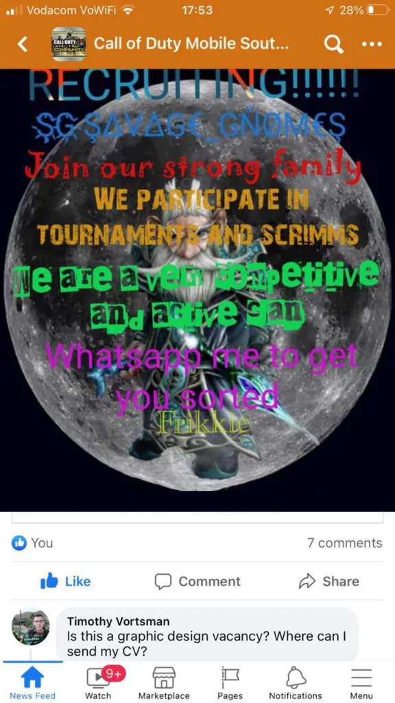
Searching for a clan wasn’t as straightforward as I thought. I came across the Call of Duty Mobile South Africa group on Facebook, where players and clans posted gameplay videos and recruitment ads. It was here that I discovered Savage Gnomes, a clan whose name immediately caught my attention. But as I clicked on their post, I was greeted with one of the most chaotic designs I’d ever seen.
Picture this: a dark, ominous moon background with a character that looked like a scaled-up hobbit or dwarf, the same size as the moon itself. Overlaying this scene was text in blue, red, orange, green, purple, and yellow, with each line rendered in a different font. It was a visual clash that would make any designer wince. But I couldn’t help but appreciate the boldness of the name itself. Savage Gnomes had a certain ring to it, and I saw the potential that extended beyond their current visual presentation.
The Cheeky Comment That Started It All
Without overthinking it, I posted a cheeky comment on their post: “Is this a graphic design vacancy? Where can I send my CV?” It was a lighthearted jab, but the idea of giving their brand a design boost stayed in my mind. I didn’t just want to comment; I wanted to show them how impactful visuals could elevate their presence. So, I decided to take matters into my own hands.
Creating a New Look: From Concept to Photoshop
First, I sketched out a simple yet cool SG logo, something that conveyed strength and unity while staying true to the playful spirit of the clan’s name. But the real transformation came when I found the perfect image to work with a garden gnome that looked like a rockstar wizard. With its long beard and wizard hat, this gnome had an attitude that screamed “savage.” The image itself was a photo of an unpainted garden gnome, but I knew that with the right touch of colour, it could become the centrepiece that Savage Gnomes needed.
In Photoshop, I began by removing the background from the original photo of the gnome, giving me a clean slate to work with. I then created a new background, opting for a bold yet cohesive colour palette to bring everything together. I kept the gnome’s robe a soft, subtle blue, contrasting it against the electric blue glow of the SG logo I designed for the background. I left the gnome’s hat in a matching shade to keep the look unified and cool-toned. For a playful touch, I emphasised the gnome’s rebellious side by keeping his tongue sticking out—a light-hearted gesture of defiance that perfectly captured the spirit of the Savage Gnomes clan.
A Lesson in Unexpected Opportunities
Sharing the design with the Savage Gnomes taught me something valuable: sometimes, the most meaningful creative projects come from spontaneous decisions and cheeky comments. What started as an impulsive idea to improve a recruitment post turned into a real design success story. It reminded me that as a designer, it’s essential to trust your instincts, jump on creative impulses, and be open to projects that push your boundaries in unexpected ways.
The experience also served as a testament to how visual identity can energize a community and bring people together. The right design doesn’t just look good; it makes people feel proud, connected, and seen.